Tuesday, 25 September 2012

Film Magazine Front Cover Research


This cover is unusual because it’s design is more like a music magazine or a film poster. The unusual part is the reel tape across the bottom in yellow; this gives the cover a unique look which makes it eye catching. The way that Bruce Willis is looking down and pointing his gun draws you to the yellow reel of tape but he is also in a position of dominance in the shot, the other characters are faded behind him in the backgorund. Three guns being in the picture make you think it is an action movie with things blowing up and pulsating action. The rain affect is typical of an action film but could also be used in a horror cover to make the scene look desperate or cold, this could be used as inspiration for our front cover. The use of lighting is interesting because it is obvious that it isn’t natural but they manage to achieve a natural look because it is faded and blends in with characters in the background, however this is not ideal for a horror cover as you want the light to mean something or signify a mood or feeling. The colour scheme is fairly standard and uninteresting but works well in this example as it leaves the strong image to make the real visual impact but also strong colours would have drawn the attention of the audience away from the yellow film reel at the bottom that includes advertisement for the contents of the magazine. They use Bruce Willis as a selling point for the film because of the audience he attracts. Often film covers will do this because to the audience the actor is a major pulling point, however we don’t have that at our disposal so we will have to make do with a good location, bright colours and dark affects, to attract the audience’s attention.

This film poster is good because it will relate to our poster as it is made to look dark and mysterious and you would a expect a horror cover to be similar. The use of colours is clever as it is the colours associated with the Joker. it also makes key points stand out, especially the illuminous green. The use of shapes is also clever the purple rounded stripe going around his lower back makes him stand out from the background and almost draws him towards the audience. The green cross (bottom right) is almost used as a box, a break between the text and the picture.
The Joker is positioned very centrally in the shot which makes him look sinister and stand out to the audience. Also the obvious figure of the Joker just gives him an immediate impact every film fan who reads this magazine will know who the Joker is, he is one of those characters that almost everyone knows, this is a great selling but also pulling point for the magazine. Centralising the character is common but not in this way usually it is just a close up of the character in this shot it is like the Joker is about to jump out of the magazine cover making him a striking figure. The light above his head is a really good affect, it is as if the city lights are above him and he is waiting to be released on to the streets, there is an eerie atmosphere that would be good to replicate.  
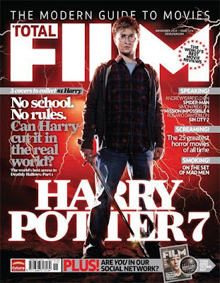


This poster is very dramatic it signifies what is proposed as being the epic finale of the Harry Potter Series, Harry Potter 7. The red lighting is interesting because you wouldn’t associate lightning with a read and orange glow with this film, it is used to give it a magical, supernatural look that suits the genre of the film. This effect is something which we could use in our magazine cover a supernatural glow would work well. The Positioning of the character is unusual because his right leg stands over the title this gives him a godly look as if he is in command and the red glow only helps to promote this feeling. The shirt he is wearing ties in with the red glow which makes him look more included in the supernatural glow. The lightning makes him look like a mythological character, as if he is about to slay a dragon or defeat an evil wizard as it is in this case. The writing is mostly in the background the grey text  especially isn’t designed to make it stand out but it does help it look professional. The main pulling point for the audience in this article is the Harry Potter figure. Harry Potter is Immensely popular and known all around the world so this cover would attract a lot of people attention. Unfortunately we will have to make more of our subject as they wont be quite as famous as Daniel Radcliffe but I think the way they have used the glow and the lighting could be a useful technique to use.

Monday, 17 September 2012

Horror Trailer Conventions

Here are some of the Horror trailer conventions I have discovered in my research:
  • Use low key lighting, but flashes of bright lighting can be include dto establish contrast.
  • Vary your camera shots this distorts the scenes for the audience.
  • Use dip through blacks this creates an element on surprise becuase you don't know what is going to appear next. This also leaves things unexplained which builds suspense and tension.
  • Always make the characters seem vulnerable, often as in the possession this is by turnign them in to the creature. The best way though I think is by playing on the audiences and characters mind by creating something that isnt there by using visual affects.
  • The music builds up as it goes along and gets more dramatic as events happen.
  • Non linear narrative is comon in horror films.
  • Story to start with seems perfectly normal such as a couple on there Honey moon or a child buying something at a car boot sale, then usually the creature or a sudden movement will kick the storyline in to prgress and it will turn more and more scarey as the trailer/film goes on.

Wednesday, 12 September 2012

The Haunting in Connecticut Trailer


This movie is really good becuase it has a few tricks in it that we could potentially use such as the sheets bellowing our from under the bed and the shadow of the man above the sleeping body but also the one of the shower curtain wrappign around th women. All quite simple tricks that could be acheived . What is espeicially good about this one is that it does manage to achieve the same affect that we want to of having  an invisible bein that is haunting them and then it is evetually revealed at the end but you only get a brief look at this in this trailer so we dont have to include that.
The use of lighting is really good in this trialer the use of shadows is espeicially good in nearly every scene there are pillars of light or unatural glows invading the darkness. The way it uses flashes from the past are unique and would be difficult to acheive but it does suit the story line so we dont need to include it , howeverin this clip thye are used well beause they are distorted and as they become clearer the characters discover more about the haunted house's past. Ther isnt much that is note wothy about the camerea angles except  the occassional close up to emphasise the importance of some objects apart from that it is fairly standard compared to other horror films.

Tuesday, 11 September 2012

The Stangers Trailer


This film is a good one to analyse becuase it would be quite an easy film to shoot, the film jsut uses an isoloated house and a couple who are being haunted by three masked people . This techique is efective as the couple dont know when the masked people are goin gto appear and they keep appearing in the house and dispappering this makes the audience think that evry tim one of them goes round a corner or looks over there shoulder there is going to be something there and can cause them to jump. This is a similar affect to what we want to achieve but I think it woul;d be scarier if the character cant see the being, so using shadows, shapes and footprint, doors slamming etc you can make it seem like the being is invisible.

The lighting is clever because it is coming from the hosue and it gives the picture a warm supernatural glow that reflects the mood of the couple who are trying to survive. The use of camera angles is espeically affective because there are a number of times when ywthe audiecne can see the beings and the characters cant a lot of wide shots and over the shoudl shots . This is a useful tool if the monster is actually there but if we want to create and affect where it is invisible then close ups are more useful but also over the shoudler shots becuase that still gives the affect that there is something there even though there isn't.

Monday, 10 September 2012

The Possession Trailer


This is an unusual concept for a horror film, however it does follow the usual conventions . The use of a child as the main character is really clever because at the start of the film she is really inocent and then as it progresses and she becomes more and more possessed she turns evil. HSe has this hideous creature inside her but agian its this concept that the moster/being is revealled to the audience in its true form until the end which build the suspence an sets the audiecnes imagination off. I think it would be good to use a child as our main character but would be difficult as there arent too many children that would want to be in a horror trailer.
The lighting is interesting as there is a lot of contrast between light and dark. The scene in the bedroom where she firsts opens the box is cleverly set up, the shadow from the tree and make sthe light flicker and creates a erie affect , this would be nice to include in our traler but would depend a lot on location. Shadows are a very important thing in a horrow movie they can be used in a lot of interesting ways to create some great affects. The way it is filmed is intereting I think what sets it apart form other horrow films its that there is a lot of dialogue between the characters most horrow films are very visual, in this case there are a lot of shot reverse shots used his makes the situation more personnel which makes sense as there is a familly involved but I dotn think this is the type of film we will create, it would be good to use more visual affects.

Paranormal Activity Trailer


The best thing about this trailer is that the couple cnat see the monster or whatever it as but the audience knwo it is there as they can see thme sleaping, this is good becuase it preys on the audiences mind and sets their imagination off. The use of a home video is interesting and unique, this makes it it more relaistic for the audience as it could be anyone filmimg it. Seeing the aufiences reaction is a good amrketing tool because its gives the audience evidence that it will be scarey.
The use of lighting is quite basic but affective at the start of the trialer it is like soemone is walkiing around with a light. Then after the night scene , there are a few brif shots of disturbing scenes that s filmed using a Bluey grey light/filter that gives it a supernatural look. there are also a lot of flashign scenes that creates a distorted look and a lot of quite cuts which builds the suspence. There are a lot of close ups in the clip most notably of the girls face when she is on the bed this shows her horror. Close ups are uite a good tool to use as it shows the characters emotion this would be a good technique to use to show how scared the characters are.

Friday, 7 September 2012

Women in Black Trailer


In many ways this is a classic horror movie, its has a great story line and a typical haunted house. It would be quite an easy film to replicate as we would just need a scarey house, the idea of having a character apearing could be possible as was long as we got the lighting right. For most of the film you can hardly see the women in black and this is quite common in a lot of films so if we coudl replicate this idea by using shadows and noises to create a monster that isnt there this would be the most scary, as it would play on the audiences mind. The fear of th eunkown is worse than the knwon and by creating soemthing that isnt there we wil be able to do this.
The use of lighting is espeicially important in horror films, I like the way in this one they used the fog to create an eire atmospher and the use of lihgting in th ehouse is espeicially good, I thnk the way they have used shadows and pillars of light, it feels lik the women in black is going to appear from the darkness which is something we shoudl try and replicate use shadows and darkness to diguise a ghost or whatevr we decide the monster to be. The use of camera angles is also clever as there are a lot of over the shoulder shots which in this situation make sit feel like something is folowing him or watching him. The film uses a lot of cut through blacks this creates a jumpy affect because you dont know what is going to appear next, this is something which I think we should look to include it distrots the viewing which makes it more scarey.