This cover is unusual because it’s design is more like a music magazine or a film poster. The unusual part is the reel tape across the bottom in yellow; this gives the cover a unique look which makes it eye catching. The way that Bruce Willis is looking down and pointing his gun draws you to the yellow reel of tape but he is also in a position of dominance in the shot, the other characters are faded behind him in the backgorund. Three guns being in the picture make you think it is an action movie with things blowing up and pulsating action. The rain affect is typical of an action film but could also be used in a horror cover to make the scene look desperate or cold, this could be used as inspiration for our front cover. The use of lighting is interesting because it is obvious that it isn’t natural but they manage to achieve a natural look because it is faded and blends in with characters in the background, however this is not ideal for a horror cover as you want the light to mean something or signify a mood or feeling. The colour scheme is fairly standard and uninteresting but works well in this example as it leaves the strong image to make the real visual impact but also strong colours would have drawn the attention of the audience away from the yellow film reel at the bottom that includes advertisement for the contents of the magazine. They use Bruce Willis as a selling point for the film because of the audience he attracts. Often film covers will do this because to the audience the actor is a major pulling point, however we don’t have that at our disposal so we will have to make do with a good location, bright colours and dark affects, to attract the audience’s attention.

This film poster is good because it will relate to our poster as it is made to look dark and mysterious and you would a expect a horror cover to be similar. The use of colours is clever as it is the colours associated with the Joker. it also makes key points stand out, especially the illuminous green. The use of shapes is also clever the purple rounded stripe going around his lower back makes him stand out from the background and almost draws him towards the audience. The green cross (bottom right) is almost used as a box, a break between the text and the picture.
The Joker is positioned very centrally in the shot which makes him look sinister and stand out to the audience. Also the obvious figure of the Joker just gives him an immediate impact every film fan who reads this magazine will know who the Joker is, he is one of those characters that almost everyone knows, this is a great selling but also pulling point for the magazine. Centralising the character is common but not in this way usually it is just a close up of the character in this shot it is like the Joker is about to jump out of the magazine cover making him a striking figure. The light above his head is a really good affect, it is as if the city lights are above him and he is waiting to be released on to the streets, there is an eerie atmosphere that would be good to replicate.
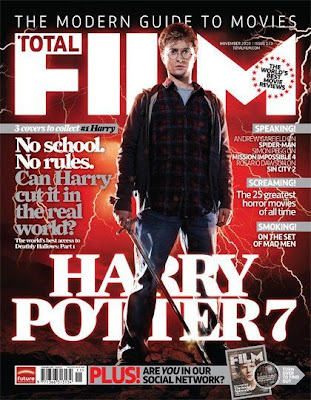
This poster is very dramatic it signifies what is proposed as being the epic finale of the Harry Potter Series, Harry Potter 7. The red lighting is interesting because you wouldn’t associate lightning with a read and orange glow with this film, it is used to give it a magical, supernatural look that suits the genre of the film. This effect is something which we could use in our magazine cover a supernatural glow would work well. The Positioning of the character is unusual because his right leg stands over the title this gives him a godly look as if he is in command and the red glow only helps to promote this feeling. The shirt he is wearing ties in with the red glow which makes him look more included in the supernatural glow. The lightning makes him look like a mythological character, as if he is about to slay a dragon or defeat an evil wizard as it is in this case. The writing is mostly in the background the grey text especially isn’t designed to make it stand out but it does help it look professional. The main pulling point for the audience in this article is the Harry Potter figure. Harry Potter is Immensely popular and known all around the world so this cover would attract a lot of people attention. Unfortunately we will have to make more of our subject as they wont be quite as famous as Daniel Radcliffe but I think the way they have used the glow and the lighting could be a useful technique to use.


No comments:
Post a Comment