Monday, 22 October 2012
Wednesday, 17 October 2012
Script for Horror trialer- Porce-lyn
Outside building
IN SCHOOL- Day
FADE IN THROUGH BLACK
Three students around the same table at lunchtime, eating individual lunches.
Inside classroom, Zooms to group of friends
PERSON A
I heard about this “haunted” hospital at Barrow Gurney, I heard that there was a patient that was never found when it was closed down for negligence, she still walks the hospital.
Shot of outside the hospital
PERSON B
Yeh I heard that story but as if its true, she was a serial killer, during a daily treatments some chemicals spilt on her face, from then on she only wore a mask. Its just a story to scare you when you were little. Her name was Lyn before she was disfigured, after she was known as Porce-Lyn
Closer shot of the hospital
PERSON C (Smug look on face)
You two might have been scared by it, but I’m a man you see.
PERSON A+B LAUGH
PERSON C
Alright alright if you’re so hard lets go after school.
PERSON A+B
Deal!
Bell rings
Pick up bags
FADE OUT THROUGH BLACK
ESTABLISHING SHOT, LOOKING AT HOSPITAL
PERSON A
Lets have a picture to prove we actually did it.
PERSON A+B+C
3-2-1 CHEESE
SCREEN FLASH LIKE CAMERA
Picture freezes on screen
Mask in background in window
Slowly zooms into mask.
PERSON C
Go on then I dare you to go inside.
PERSON A
You first then “bigshot”
PERSON B
Lets all go together
ENTER BUILDING TOGETHER
LAUGHING AND JOKING
Fade through black (laughing carries on)
NOISE
PERSON A+B TURN AROUND
PERSON A+B
Person C?!
PERSON A+B LOOK AT EACH OTEHR
LOUD SCREAM (HELP!)
PERSON A
PESON C?!!
Run into same room
See PERSON C hanging
Look down, see message in blood –“RUN!”
PERSON A+B running to exit
Cameraman runs behind
Doors slam shut
Go to different room
Person B +A heavy breathing
Trying to escape out the locked window
Person A
Hurry up! Lets leave it!!
The mask appears in reflection behind shoulder.
Fade through
Friday, 5 October 2012
Horror Trailer Initial Idea
· Mental Hospital- Barrow Gurney.
· Haunted by ex patient, miss treated during their stay.
· Were in solitary confinement
· Murderer mentally unstable.
· Women murderer going against stereotype. Male following conventions of horror trailer.
· Face was disfigured from chemical treatment gone wrong.
· Always wore a mask from then on. Doll mask preferably. Never spoke.
· Start with flashback of chemical incident, then go forward to 2012 Mental hospital shut down for negligence.
· All patients moved to separate hospital but one was never found.
· Friends dare each other to go in to abandoned hospital, small group 2-3.
· Various rooms- Noose, message in blood/red paint, chair in middle room.
· Loud scream from one room, door slams and locks. Film legs dangling and swaying, friend thinks he has been hanged runs out.
· Running cant find exit/ exit doors slam.
· Goes to a window to try and get out, masked figure in reflection, turns round not there.
Monday, 1 October 2012
Film Poster Research


This poster uses an obvious marketing technique and that is Daniel Radcliffe but aside from that it is quite a good poster. The greeney blue filter colour they have used makes it look supernatural and mysterious but also gives the image a lot of contrast which is effective because of the horror genre. We could use a, high contrast image and a filter to give it a spooky effect like this one. Having the black figure behind him makes him look like he is being haunted. It tells the audience that this mysterious “Women in Black” figure is going to play a big part. The haunted house is also effective as it sets the scene but here is also something ominous about a grave yard and a mysterious looking tree. The way the light shines across his face and the moody expression makes him look like a hero; it is trying to attract the majority of the Harry Potter audience, teenage girls who love the main characters. The bright distorted lighting ties in with the Gothic setting and makes it stand out.

This poster uses a scary scene with a blue filter to attract your attention, as well as the title and captions in the bottom half in bold lettering. The picture of the lady pointing at the shadow on the door makes the audience think that they are being haunted by a ghost. It is a wide shot to reveal the whole room and make the audience think that they could be attacked from any angle, quite a clever shot to include on a poster. The scene looks very jumpy and this would attract a horror audience who liked to be spooked and scared. “What happens when you sleep” applies to the image making the audience inquisitive about what happens at night in this scene and film. “Don’t see it alone” makes a horror audience want to go see it with friends and find out what it is all about. The review comments at the top of the page are a great marketing technique; we could use this and make some up if we were allowed.
The layout of the poster is very simple but effective, if it was complicated it wouldn't stand out, there is a balance between messy and too simplistic that we need to find. The home made video technique is clever it adds realism to the scene and adds to the scary affect.
Tuesday, 25 September 2012
Film Magazine Front Cover Research


This film poster is good because it will relate to our poster as it is made to look dark and mysterious and you would a expect a horror cover to be similar. The use of colours is clever as it is the colours associated with the Joker. it also makes key points stand out, especially the illuminous green. The use of shapes is also clever the purple rounded stripe going around his lower back makes him stand out from the background and almost draws him towards the audience. The green cross (bottom right) is almost used as a box, a break between the text and the picture.
The Joker is positioned very centrally in the shot which makes him look sinister and stand out to the audience. Also the obvious figure of the Joker just gives him an immediate impact every film fan who reads this magazine will know who the Joker is, he is one of those characters that almost everyone knows, this is a great selling but also pulling point for the magazine. Centralising the character is common but not in this way usually it is just a close up of the character in this shot it is like the Joker is about to jump out of the magazine cover making him a striking figure. The light above his head is a really good affect, it is as if the city lights are above him and he is waiting to be released on to the streets, there is an eerie atmosphere that would be good to replicate.

Monday, 17 September 2012
Horror Trailer Conventions
Here are some of the Horror trailer conventions I have discovered in my research:
- Use low key lighting, but flashes of bright lighting can be include dto establish contrast.
- Vary your camera shots this distorts the scenes for the audience.
- Use dip through blacks this creates an element on surprise becuase you don't know what is going to appear next. This also leaves things unexplained which builds suspense and tension.
- Always make the characters seem vulnerable, often as in the possession this is by turnign them in to the creature. The best way though I think is by playing on the audiences and characters mind by creating something that isnt there by using visual affects.
- The music builds up as it goes along and gets more dramatic as events happen.
- Non linear narrative is comon in horror films.
- Story to start with seems perfectly normal such as a couple on there Honey moon or a child buying something at a car boot sale, then usually the creature or a sudden movement will kick the storyline in to prgress and it will turn more and more scarey as the trailer/film goes on.
Wednesday, 12 September 2012
The Haunting in Connecticut Trailer
This movie is really good becuase it has a few tricks in it that we could potentially use such as the sheets bellowing our from under the bed and the shadow of the man above the sleeping body but also the one of the shower curtain wrappign around th women. All quite simple tricks that could be acheived . What is espeicially good about this one is that it does manage to achieve the same affect that we want to of having an invisible bein that is haunting them and then it is evetually revealed at the end but you only get a brief look at this in this trailer so we dont have to include that.
The use of lighting is really good in this trialer the use of shadows is espeicially good in nearly every scene there are pillars of light or unatural glows invading the darkness. The way it uses flashes from the past are unique and would be difficult to acheive but it does suit the story line so we dont need to include it , howeverin this clip thye are used well beause they are distorted and as they become clearer the characters discover more about the haunted house's past. Ther isnt much that is note wothy about the camerea angles except the occassional close up to emphasise the importance of some objects apart from that it is fairly standard compared to other horror films.
Tuesday, 11 September 2012
The Stangers Trailer
This film is a good one to analyse becuase it would be quite an easy film to shoot, the film jsut uses an isoloated house and a couple who are being haunted by three masked people . This techique is efective as the couple dont know when the masked people are goin gto appear and they keep appearing in the house and dispappering this makes the audience think that evry tim one of them goes round a corner or looks over there shoulder there is going to be something there and can cause them to jump. This is a similar affect to what we want to achieve but I think it woul;d be scarier if the character cant see the being, so using shadows, shapes and footprint, doors slamming etc you can make it seem like the being is invisible.
The lighting is clever because it is coming from the hosue and it gives the picture a warm supernatural glow that reflects the mood of the couple who are trying to survive. The use of camera angles is espeically affective because there are a number of times when ywthe audiecne can see the beings and the characters cant a lot of wide shots and over the shoudl shots . This is a useful tool if the monster is actually there but if we want to create and affect where it is invisible then close ups are more useful but also over the shoudler shots becuase that still gives the affect that there is something there even though there isn't.
Monday, 10 September 2012
The Possession Trailer
This is an unusual concept for a horror film, however it does follow the usual conventions . The use of a child as the main character is really clever because at the start of the film she is really inocent and then as it progresses and she becomes more and more possessed she turns evil. HSe has this hideous creature inside her but agian its this concept that the moster/being is revealled to the audience in its true form until the end which build the suspence an sets the audiecnes imagination off. I think it would be good to use a child as our main character but would be difficult as there arent too many children that would want to be in a horror trailer.
The lighting is interesting as there is a lot of contrast between light and dark. The scene in the bedroom where she firsts opens the box is cleverly set up, the shadow from the tree and make sthe light flicker and creates a erie affect , this would be nice to include in our traler but would depend a lot on location. Shadows are a very important thing in a horrow movie they can be used in a lot of interesting ways to create some great affects. The way it is filmed is intereting I think what sets it apart form other horrow films its that there is a lot of dialogue between the characters most horrow films are very visual, in this case there are a lot of shot reverse shots used his makes the situation more personnel which makes sense as there is a familly involved but I dotn think this is the type of film we will create, it would be good to use more visual affects.
Paranormal Activity Trailer
The best thing about this trailer is that the couple cnat see the monster or whatever it as but the audience knwo it is there as they can see thme sleaping, this is good becuase it preys on the audiences mind and sets their imagination off. The use of a home video is interesting and unique, this makes it it more relaistic for the audience as it could be anyone filmimg it. Seeing the aufiences reaction is a good amrketing tool because its gives the audience evidence that it will be scarey.
The use of lighting is quite basic but affective at the start of the trialer it is like soemone is walkiing around with a light. Then after the night scene , there are a few brif shots of disturbing scenes that s filmed using a Bluey grey light/filter that gives it a supernatural look. there are also a lot of flashign scenes that creates a distorted look and a lot of quite cuts which builds the suspence. There are a lot of close ups in the clip most notably of the girls face when she is on the bed this shows her horror. Close ups are uite a good tool to use as it shows the characters emotion this would be a good technique to use to show how scared the characters are.
Friday, 7 September 2012
Women in Black Trailer
In many ways this is a classic horror movie, its has a great story line and a typical haunted house. It would be quite an easy film to replicate as we would just need a scarey house, the idea of having a character apearing could be possible as was long as we got the lighting right. For most of the film you can hardly see the women in black and this is quite common in a lot of films so if we coudl replicate this idea by using shadows and noises to create a monster that isnt there this would be the most scary, as it would play on the audiences mind. The fear of th eunkown is worse than the knwon and by creating soemthing that isnt there we wil be able to do this.
The use of lighting is espeicially important in horror films, I like the way in this one they used the fog to create an eire atmospher and the use of lihgting in th ehouse is espeicially good, I thnk the way they have used shadows and pillars of light, it feels lik the women in black is going to appear from the darkness which is something we shoudl try and replicate use shadows and darkness to diguise a ghost or whatevr we decide the monster to be. The use of camera angles is also clever as there are a lot of over the shoulder shots which in this situation make sit feel like something is folowing him or watching him. The film uses a lot of cut through blacks this creates a jumpy affect because you dont know what is going to appear next, this is something which I think we should look to include it distrots the viewing which makes it more scarey.
Tuesday, 10 July 2012
Monday, 9 July 2012
The Start of A2 Media
I am now moving on to A2 having completed the peliminary task, we have now started working on our A2 coursework.
Sunday, 15 April 2012
Friday, 13 April 2012
Decline in Music Magazine Industry
Music magazines in the last two years have suffered a steep decline in sales. NME, Q and uncut saw a double digit year on year sales decline in 2011. IPC media who distribute NME and Uncut among others, saw a 14.2% drop on circulation figures of its magazines in 2011. This drop in sales come about because of competition form websites, blogs and the increasing number of free magazines. Bauer media who remain the biggest selling paid for magazine despite Q magazine seeing a 12.1% drop in year on year sales to 77,522, however the only magazine to increase its circulation period on period was Mojo also distributed by Bauer. This shows that there is still a market out there for a new music magazine.
I think that the music magazine industry will have to change the way it distributes and sells its magazines. The digital sales of music in 2011 rose by 24.7%, if the music magazine industry was to follow this trend and sell there magazines digitally then there could be a revival in the industry. I think if my magazine went on sale through an app (as well as physical copies) that you could download from iTunes and the android market it would be profitable; they could have to pay for the app download and this would give people the option then paying for a subscription or to pay for each magazine individually to give you a downloadable version of the magazine. This could be successful as the rise of the Kindle and other tablets as shown that let you read books and newspapers that have been downloaded have shown that it can work and you could also target this audience.
I think that the music magazine industry will have to change the way it distributes and sells its magazines. The digital sales of music in 2011 rose by 24.7%, if the music magazine industry was to follow this trend and sell there magazines digitally then there could be a revival in the industry. I think if my magazine went on sale through an app (as well as physical copies) that you could download from iTunes and the android market it would be profitable; they could have to pay for the app download and this would give people the option then paying for a subscription or to pay for each magazine individually to give you a downloadable version of the magazine. This could be successful as the rise of the Kindle and other tablets as shown that let you read books and newspapers that have been downloaded have shown that it can work and you could also target this audience.
Monday, 19 March 2012
Developement of Double page spread
 This is the Final version of my double page spread. I decided that the previous version was to plain and boring and compared to my previous pages didn't represent the punk rock genre because the colours and style were plain. I decided to edit the photo slightly to bring more colour in to the image. I decided to use purple again because I think this represents the genre well,I used a similar purple on my front cover and it stands out from the background well. To make the purple stone and band members stand out more I burned the trees behind them, this darkened them and added to the mood as well as adding contrast. I changed the "We talk to them about their success story" and the "we didn't realise we were this talented" text to blue using the same colour as one of the band member's (Dan Febry) trousers, this tied the image in with the double page spread nicely. I added text on to the stone in the image, just to add more detail to the double page spread. The other thing I changed was the colour of the "Tour dates" column to purple this was to carry on the blue and purple colour scheme. Lots of music magazines, on their double page spread have a separate column which is about a subject which isn't related to the main topic. I decided to followed this convention because I wanted to add variety to the page's and make it look more professional. I am a bit disappointed with how small the margins are next to my article but if I deleted some of the text it would disrupt the layout and if I made it smaller it would be too hard to read.
 The next stage was to add the text. I had already written the text on word so all I had to was copy the text in to photoshop. When I first added the text I had it in one big block but then when I looked back at the research I had done, they all had the text in columns so to make mine look like a professional magazine I changed mine to two columns and put a black line in between to make a distinct divide between the columns and because the double page spread I had research and I was using as a model had this feature as well. I thought something was missing and I decided to highlight a key phrase in red with a black box using the same style as the "we talk to them about there success story", another reason for including this was the double page spread I was using as a model had this feature as well.
 I did change the position and the text itself of the "How the made it to the top..." because I felt that by being at the top of the page as a header was too restricting on the layout and it didn't make the double page spread look similar or as good as the double page spread I was emulating. To help it look more like the one I was emulating and make the "we talk to them about there success story" text stand out I added a black box behind the text. I decided to change the angle of the "fatality" title which I got from the Paramore double page spread I researched
 to make it look a bit more edgy.

I decided to try and use the colour scheme of the contents page and have black, red and white because I thought it would suit the double page spread well. Most of the magazines I had researched had a large image dominating the page and I decided I wanted to use this convention and have a large image to the left of the double page spread, this is something I didn't change through out my development as it allowed me to fit the rest of the pieces around the image, it gave me a platform to work from. This is the same with my previous pages the image came first in the design. I then started to add the main bits of text the two titles.
Thursday, 15 March 2012
Photo decision for double page spread


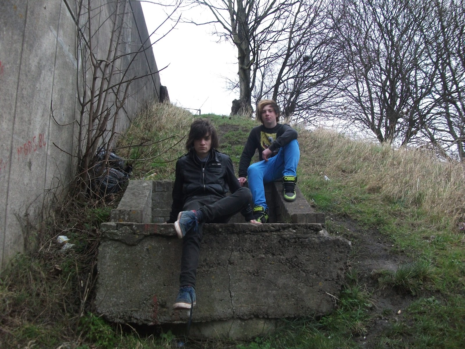 This photo that I selected did suit the look and layout I wanted to create; it was easy to crop to fit in to the layout as it wasn't too rectangular. I chose this photo because I liked the setting, the rural, grungy look and the fact the band members are on higher ground, this relates well to the article in the double page spread which is about them reaching the top of the music business. It symbolises their success and none of the other images were able to do this in the same way. It represents their background and where they grew up in the outskirts of Bristol. The only difficulty with this image was how I was going to edit the image to make it look unique.
Wednesday, 7 March 2012
Double Page Spread Photo Options
These are the best of the remaining photos from my two photo shoots, they all have an individual style but I needed an image which would suit the layout and style I wanted to use.
 This is a good image because the colour scheme suits the band members and style I was trying to create, the black and white. I really like the graffiti its a very clear, eye catching image. However the angle that the image was take doesn't look that good and again as with the previous image it would have been difficult to crop the image enough to fit in to the layout where I wanted it to. The red bollards block out some of the image which means I would of had to chop that bit off.
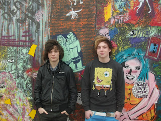
 I think this photo does look good because of the colourful graffiti behind the band members but I felt that this image was too similar to the images I used on the contents page and front cover, despite this because I liked the image I tried the image out to see how it would work with the layout I was trying to create. However it didn't work out the size of the image was wrong for the space I wanted to use and because the band members took up a lot of the image I couldn't crop it much to make it fit. It was a shame not to use this image because it is really striking but none of the designs I had in mind suited the image. There is all most too much colour to be able to make use of the image.
 This photo is nice because of the divide between the park and the building site the background adding a bit of variation to the photo. I didn't like the way the band members were positioned and because of their quirky look they look a bit out of place and the setting didn't represent the Punk rock genre very well.
 This photo I like because of the casual pose the band members adopted and the rural setting but I think the background is a bit messy and not clear cut, giving the picture a distorted look. If I was going to use this photo I would either have to remove the background or blur it out and neither of those options seemed right for what I was trying to create.


 This photo I like because of the casual pose the band members adopted and the rural setting but I think the background is a bit messy and not clear cut, giving the picture a distorted look. If I was going to use this photo I would either have to remove the background or blur it out and neither of those options seemed right for what I was trying to create.
 Monday, 27 February 2012
Double Page Spread Research

This is a conventional double page spread. Most double page spreads have a large image of the featured artist and an article around it. In this case though the image is especially large taking a whole page, this means that it dominates the two pages and draws your attentions to it, I think they have done it this way because the band featured isn’t very well known or main stream. As the image is so big it is key to setting the tone of the double page spread, the image is usually related to what the subject of the text is about. In this case the image shows the band members in a bedroom, this suggests that they are letting you in on their personal life and the article is about getting to know the band members. It uses a simple colour scheme black, white and blue. They use the blue to highlight things to make them stand out, this is effective because there is quite a lot of content on the two pages and the blue highlights the important bits for the reader. A column dedicated to different lesser known bands is included to add variety to the double page spread and they separate it by having it on a black background, where as the rest has a white background. I like the use of colour in this double page spread and the fact that it is dominated by a large image but I think the layout is too simple for my style of magazine and in order to carry on my alternative punk rock theme, mine will need to have a more unusual style.

This double page spread has an unusual layout, the image covers the whole page and the Paramore text is on an angle, it has little text compared to other magazines. The main difference in style to other magazines is the way they have used the image, the guys in the band are in black and white and act as the background, where as Hayley Williams the lead singer is in colour, this portrays that she has a higher status than the other members, it highlights the fact that she is the lead singer and that she is the only girl in the band. The Paramore text is yellow which ties in with the lead singer’s hair which is blond and ginger, this also helps to display here dominance as they use her colours for the bands title. The edgy, different style is used to reflects the nature of the band and their style, I want to try and create a similar style in my double page spread maybe use some text on an angle and use a small amount of text.

This double page spread has an unusual layout it has one main image in the centre of the lead singer of one bands and then dotted around it separate pictures of other artist, usually the double page spread includes an image of all the member is one band . This double page spread is about a live performance where as normally the article would include an interview of an artist. The colour scheme is very dark, black, dark green and dark red this is because the featured band is a metal band so it is representative of the genre. There a small amount of writing compared to most articles, a reason for this may be that they haven’t interviewed the artist so they haven’t got that content to use and talk about in the article, just the information about the live performance. The right hand column has reactions from some of the crowd members and the picture in the bottom right hand corner shows the crowd having a good time these features are important in promoting the artists who performed and allows the reader to relate to the event. I like the idea of having lots of different images in the double page spread but as I am probably only having one artist features on my double page spread I will just us the generic one picture group shot format and have the text around it.

This double page spread stands out because, the title text is really big compared to the rest of the page and is in a contrasting fancy font, the rest of the magazine is pretty plain and simple. The colour scheme is quite boring, only black, white and greys are used, this helps give the double page spread a professional, clean and modern look. The group’s picture takes up a lot of the page but the big title “the Joshua code” still dominates the page, the picture has a its own separate colour scheme all the band members are wearing blue, this makes them stand out from the plain grey background. The reading and Leeds advertisement in the top left corner draws your attention because it is completely contrasting colours to the rest of the magazine. The title itself “The Joshua Code” draws your attention because it is none descriptive and makes you want to read the article to find out what it means. Overall this double page spread looks very professional but it isn’t unique apart from the unusual format of the title. I think I want my double page spread to look less mainstream, keep it simple and use brighter colours. I like the idea of the large title standing out and may use incorporate this idea in to my double page spread design.
Tuesday, 7 February 2012
Contents Page Final Stages

This is the final version of my contents page. I copied the way in which the features section is formatted from one of the contents pages I researched.This means putting the features at the bottom of the page in a continuous list, in a block paragraph. It took me a little while to find the right font. I tried to using the ones from my front cover but they didn't look right because they weren't clear enough so I had to use a different font to make the block paragragh style work. I decided to use this layout because it is a bit different and I thought to carry on the theme of my front cover it would have to look a bit edgy and different. The way in which the features section is formatted helps achieve this look.
I came up with the idea of having the Fatality down the side of the image and using the first two letters as an acrostic because I wanted the Fatality contents to be separate from the rest of the features at the bottom of the page. I also think it makes the page look more professional and neat as well as edgy and a bit different.
Overall I am really pleased with my contents page I think is looks simple and effective with a couple of unusual twists which makes it stand out from other contents pages.
 |
This is the first stage of my contents page. Like most contents pages the image is the main focus of the page. I was planning to have text at the bottom of the page so I had to leave a space for that. I used the same flux graphics as my front cover, magazines do this to make their magazine logo become iconic. I decided to use a plain white background because the version where I have used a pink and black background didn't work and didn't look proffessional so I decided to copy most other well known magazine contents pages such as Q and Kerrang and use a simple colour scheme; black, white and red this colour scheme also compliments the picture because the graphiti is black and white and the heart is red. I used the eyedropper tool to copy the red of the heart in the graphiti and then use it for the title, this means that the it ties in with the image.
Photo Decision for Contents Page

two band members, black and white,wild and the unique style. The red heart stands out in contradicts the rest of the image, this helps give it an edgy look.
First drafts and layout experiments

 On this contents page I was experimenting with the idea of having the picture on an angle. I got this idea form a smaller image in my research of a Q magazine it does look quite quirky and funky but I realised that this idea wouldn't be functional and the tilted image would just look a bit strange and not proffessional.
 Contents page photo edits


I liked the colours in the background of this photo. I used the quick selection tool to select the background so that I could apply a filter to it and not the band members. I experimented with the different artistic filters and made a decision on one calle drough pastels. The filter makes the image look more graphic and the colours have merged together a bit adding to the affect and feel of the graffiti.
Monday, 30 January 2012
Second photoshoot for contents page
This shows I have shot a variety of material appropriate to the task set as I have used a variety of graffiti and urdan settings, to create a grungy punk rock feel. I have used these settings as the article later in the magazine is about thier rise to stardom from their urban background.


Friday, 27 January 2012
Contents Page Research


This one is similar to want I want mine to look like it has a big image and writing around it. Most of the writing on the cover pages are in a listed bullet point format with the page number next to it and I may use a similar format. Most contents pages are usually black white and then small bits in the featured colour which in this case is red. The Sans-serif text is informal and easy to read. This page uses boxes to separate all the individual bits on the page this gives it a professional look.
 I don’t think this is a good contents page. It doesn’t have any sort of colour scheme. The blurred background just makes the page look untidy and not very professional. The contents listed looks like I is in a good order but two of the pages are in the separate colour at the bottom which makes it looks untidy. I do like his use of text with the “features” going down the side of the contents. The picture in the bottom half of the page looks over edited.
I like this contents page as it is a bit different and I am thinking of trying to continue the edgy style that I used on contents page. The writing is on the picture, which is the whole of the background which is unusual for a contents page as the picture is usually less than half of the page or contains multiple images. The use of text is clever at the bottom of the page as it is a block of text but because they have used two different sizes of text it is clear and not confusing I think I might use this style. The use of colour is interesting as it is all in black and white which gives it a unique style. The image on the bottom of the skateboard doesn’t stand out but they have decided to put it in the middle of the page to draw your attention the detail.

This is quite an interesting contents page, it has one large image dominating the page but the image in the bottom left corner draws your attention as it is at an angle where as the rest of the page is at right angles, it is also in landscape and the large image is in portrait which adds an edgy twist. The colours keep to a black white and red colour scheme but they decide to put the large photograph in black and white to add contrast to the red in the page. Mainly this page is about contrast between the different components on the page. I think I am going to try and make sure there is contrast between each component and maybe use a black and white image to achieve this effect.
Subscribe to:
Comments (Atom)