Sunday, 15 April 2012

Friday, 13 April 2012
Decline in Music Magazine Industry
Music magazines in the last two years have suffered a steep decline in sales. NME, Q and uncut saw a double digit year on year sales decline in 2011. IPC media who distribute NME and Uncut among others, saw a 14.2% drop on circulation figures of its magazines in 2011. This drop in sales come about because of competition form websites, blogs and the increasing number of free magazines. Bauer media who remain the biggest selling paid for magazine despite Q magazine seeing a 12.1% drop in year on year sales to 77,522, however the only magazine to increase its circulation period on period was Mojo also distributed by Bauer. This shows that there is still a market out there for a new music magazine.
I think that the music magazine industry will have to change the way it distributes and sells its magazines. The digital sales of music in 2011 rose by 24.7%, if the music magazine industry was to follow this trend and sell there magazines digitally then there could be a revival in the industry. I think if my magazine went on sale through an app (as well as physical copies) that you could download from iTunes and the android market it would be profitable; they could have to pay for the app download and this would give people the option then paying for a subscription or to pay for each magazine individually to give you a downloadable version of the magazine. This could be successful as the rise of the Kindle and other tablets as shown that let you read books and newspapers that have been downloaded have shown that it can work and you could also target this audience.
I think that the music magazine industry will have to change the way it distributes and sells its magazines. The digital sales of music in 2011 rose by 24.7%, if the music magazine industry was to follow this trend and sell there magazines digitally then there could be a revival in the industry. I think if my magazine went on sale through an app (as well as physical copies) that you could download from iTunes and the android market it would be profitable; they could have to pay for the app download and this would give people the option then paying for a subscription or to pay for each magazine individually to give you a downloadable version of the magazine. This could be successful as the rise of the Kindle and other tablets as shown that let you read books and newspapers that have been downloaded have shown that it can work and you could also target this audience.
Monday, 19 March 2012
Developement of Double page spread
 This is the Final version of my double page spread. I decided that the previous version was to plain and boring and compared to my previous pages didn't represent the punk rock genre because the colours and style were plain. I decided to edit the photo slightly to bring more colour in to the image. I decided to use purple again because I think this represents the genre well,I used a similar purple on my front cover and it stands out from the background well. To make the purple stone and band members stand out more I burned the trees behind them, this darkened them and added to the mood as well as adding contrast. I changed the "We talk to them about their success story" and the "we didn't realise we were this talented" text to blue using the same colour as one of the band member's (Dan Febry) trousers, this tied the image in with the double page spread nicely. I added text on to the stone in the image, just to add more detail to the double page spread. The other thing I changed was the colour of the "Tour dates" column to purple this was to carry on the blue and purple colour scheme. Lots of music magazines, on their double page spread have a separate column which is about a subject which isn't related to the main topic. I decided to followed this convention because I wanted to add variety to the page's and make it look more professional. I am a bit disappointed with how small the margins are next to my article but if I deleted some of the text it would disrupt the layout and if I made it smaller it would be too hard to read.
 The next stage was to add the text. I had already written the text on word so all I had to was copy the text in to photoshop. When I first added the text I had it in one big block but then when I looked back at the research I had done, they all had the text in columns so to make mine look like a professional magazine I changed mine to two columns and put a black line in between to make a distinct divide between the columns and because the double page spread I had research and I was using as a model had this feature as well. I thought something was missing and I decided to highlight a key phrase in red with a black box using the same style as the "we talk to them about there success story", another reason for including this was the double page spread I was using as a model had this feature as well.
 I did change the position and the text itself of the "How the made it to the top..." because I felt that by being at the top of the page as a header was too restricting on the layout and it didn't make the double page spread look similar or as good as the double page spread I was emulating. To help it look more like the one I was emulating and make the "we talk to them about there success story" text stand out I added a black box behind the text. I decided to change the angle of the "fatality" title which I got from the Paramore double page spread I researched
 to make it look a bit more edgy.

I decided to try and use the colour scheme of the contents page and have black, red and white because I thought it would suit the double page spread well. Most of the magazines I had researched had a large image dominating the page and I decided I wanted to use this convention and have a large image to the left of the double page spread, this is something I didn't change through out my development as it allowed me to fit the rest of the pieces around the image, it gave me a platform to work from. This is the same with my previous pages the image came first in the design. I then started to add the main bits of text the two titles.
Thursday, 15 March 2012
Photo decision for double page spread


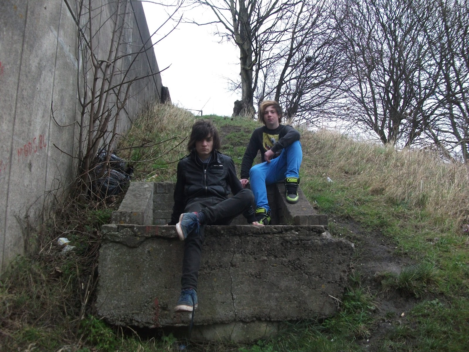 This photo that I selected did suit the look and layout I wanted to create; it was easy to crop to fit in to the layout as it wasn't too rectangular. I chose this photo because I liked the setting, the rural, grungy look and the fact the band members are on higher ground, this relates well to the article in the double page spread which is about them reaching the top of the music business. It symbolises their success and none of the other images were able to do this in the same way. It represents their background and where they grew up in the outskirts of Bristol. The only difficulty with this image was how I was going to edit the image to make it look unique.
Wednesday, 7 March 2012
Double Page Spread Photo Options
These are the best of the remaining photos from my two photo shoots, they all have an individual style but I needed an image which would suit the layout and style I wanted to use.
 This is a good image because the colour scheme suits the band members and style I was trying to create, the black and white. I really like the graffiti its a very clear, eye catching image. However the angle that the image was take doesn't look that good and again as with the previous image it would have been difficult to crop the image enough to fit in to the layout where I wanted it to. The red bollards block out some of the image which means I would of had to chop that bit off.
 I think this photo does look good because of the colourful graffiti behind the band members but I felt that this image was too similar to the images I used on the contents page and front cover, despite this because I liked the image I tried the image out to see how it would work with the layout I was trying to create. However it didn't work out the size of the image was wrong for the space I wanted to use and because the band members took up a lot of the image I couldn't crop it much to make it fit. It was a shame not to use this image because it is really striking but none of the designs I had in mind suited the image. There is all most too much colour to be able to make use of the image.
 This photo is nice because of the divide between the park and the building site the background adding a bit of variation to the photo. I didn't like the way the band members were positioned and because of their quirky look they look a bit out of place and the setting didn't represent the Punk rock genre very well.
 This photo I like because of the casual pose the band members adopted and the rural setting but I think the background is a bit messy and not clear cut, giving the picture a distorted look. If I was going to use this photo I would either have to remove the background or blur it out and neither of those options seemed right for what I was trying to create.


 This photo I like because of the casual pose the band members adopted and the rural setting but I think the background is a bit messy and not clear cut, giving the picture a distorted look. If I was going to use this photo I would either have to remove the background or blur it out and neither of those options seemed right for what I was trying to create.
 Monday, 27 February 2012
Double Page Spread Research

This is a conventional double page spread. Most double page spreads have a large image of the featured artist and an article around it. In this case though the image is especially large taking a whole page, this means that it dominates the two pages and draws your attentions to it, I think they have done it this way because the band featured isn’t very well known or main stream. As the image is so big it is key to setting the tone of the double page spread, the image is usually related to what the subject of the text is about. In this case the image shows the band members in a bedroom, this suggests that they are letting you in on their personal life and the article is about getting to know the band members. It uses a simple colour scheme black, white and blue. They use the blue to highlight things to make them stand out, this is effective because there is quite a lot of content on the two pages and the blue highlights the important bits for the reader. A column dedicated to different lesser known bands is included to add variety to the double page spread and they separate it by having it on a black background, where as the rest has a white background. I like the use of colour in this double page spread and the fact that it is dominated by a large image but I think the layout is too simple for my style of magazine and in order to carry on my alternative punk rock theme, mine will need to have a more unusual style.

This double page spread has an unusual layout, the image covers the whole page and the Paramore text is on an angle, it has little text compared to other magazines. The main difference in style to other magazines is the way they have used the image, the guys in the band are in black and white and act as the background, where as Hayley Williams the lead singer is in colour, this portrays that she has a higher status than the other members, it highlights the fact that she is the lead singer and that she is the only girl in the band. The Paramore text is yellow which ties in with the lead singer’s hair which is blond and ginger, this also helps to display here dominance as they use her colours for the bands title. The edgy, different style is used to reflects the nature of the band and their style, I want to try and create a similar style in my double page spread maybe use some text on an angle and use a small amount of text.

This double page spread has an unusual layout it has one main image in the centre of the lead singer of one bands and then dotted around it separate pictures of other artist, usually the double page spread includes an image of all the member is one band . This double page spread is about a live performance where as normally the article would include an interview of an artist. The colour scheme is very dark, black, dark green and dark red this is because the featured band is a metal band so it is representative of the genre. There a small amount of writing compared to most articles, a reason for this may be that they haven’t interviewed the artist so they haven’t got that content to use and talk about in the article, just the information about the live performance. The right hand column has reactions from some of the crowd members and the picture in the bottom right hand corner shows the crowd having a good time these features are important in promoting the artists who performed and allows the reader to relate to the event. I like the idea of having lots of different images in the double page spread but as I am probably only having one artist features on my double page spread I will just us the generic one picture group shot format and have the text around it.

This double page spread stands out because, the title text is really big compared to the rest of the page and is in a contrasting fancy font, the rest of the magazine is pretty plain and simple. The colour scheme is quite boring, only black, white and greys are used, this helps give the double page spread a professional, clean and modern look. The group’s picture takes up a lot of the page but the big title “the Joshua code” still dominates the page, the picture has a its own separate colour scheme all the band members are wearing blue, this makes them stand out from the plain grey background. The reading and Leeds advertisement in the top left corner draws your attention because it is completely contrasting colours to the rest of the magazine. The title itself “The Joshua Code” draws your attention because it is none descriptive and makes you want to read the article to find out what it means. Overall this double page spread looks very professional but it isn’t unique apart from the unusual format of the title. I think I want my double page spread to look less mainstream, keep it simple and use brighter colours. I like the idea of the large title standing out and may use incorporate this idea in to my double page spread design.
Tuesday, 7 February 2012
Contents Page Final Stages

This is the final version of my contents page. I copied the way in which the features section is formatted from one of the contents pages I researched.This means putting the features at the bottom of the page in a continuous list, in a block paragraph. It took me a little while to find the right font. I tried to using the ones from my front cover but they didn't look right because they weren't clear enough so I had to use a different font to make the block paragragh style work. I decided to use this layout because it is a bit different and I thought to carry on the theme of my front cover it would have to look a bit edgy and different. The way in which the features section is formatted helps achieve this look.
I came up with the idea of having the Fatality down the side of the image and using the first two letters as an acrostic because I wanted the Fatality contents to be separate from the rest of the features at the bottom of the page. I also think it makes the page look more professional and neat as well as edgy and a bit different.
Overall I am really pleased with my contents page I think is looks simple and effective with a couple of unusual twists which makes it stand out from other contents pages.
 |
This is the first stage of my contents page. Like most contents pages the image is the main focus of the page. I was planning to have text at the bottom of the page so I had to leave a space for that. I used the same flux graphics as my front cover, magazines do this to make their magazine logo become iconic. I decided to use a plain white background because the version where I have used a pink and black background didn't work and didn't look proffessional so I decided to copy most other well known magazine contents pages such as Q and Kerrang and use a simple colour scheme; black, white and red this colour scheme also compliments the picture because the graphiti is black and white and the heart is red. I used the eyedropper tool to copy the red of the heart in the graphiti and then use it for the title, this means that the it ties in with the image.
Subscribe to:
Posts (Atom)